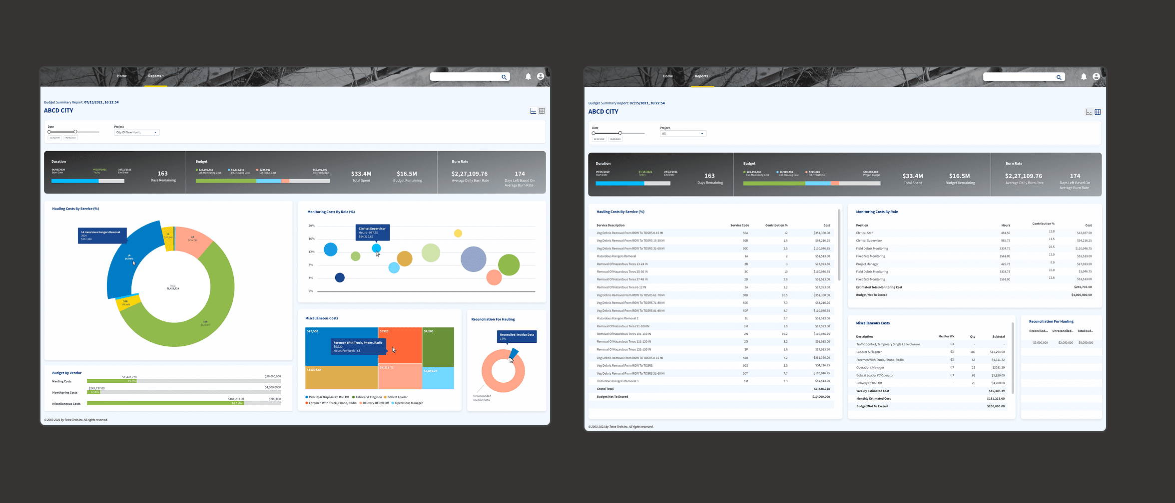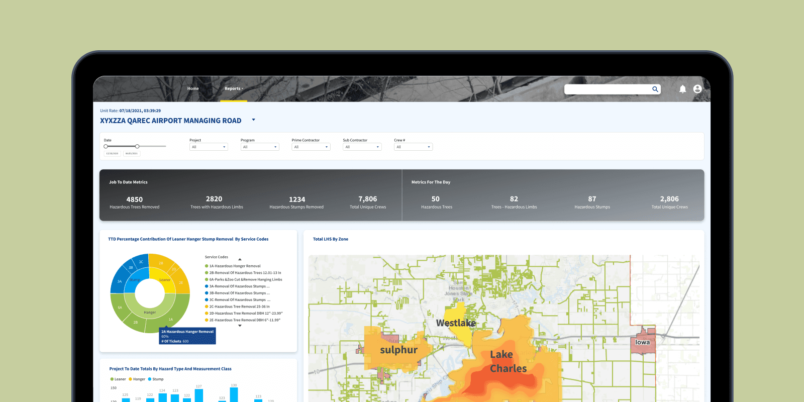
Key decision
Finding the right visualisation for the data
Every required dataset had to be visible within minutes of opening a report — not buried behind navigation, filters, or secondary screens.
Rationale
There were different stakeholders that needed different parameters — four different reports for different purposes.
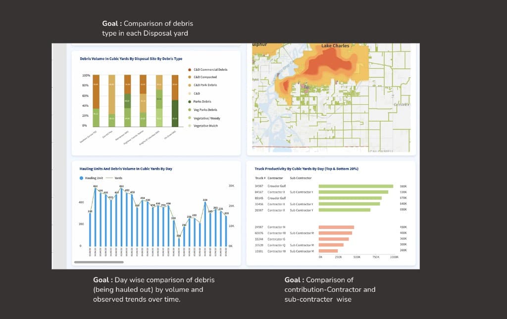
Haul Out
Debris volume/weight by site, day, type
ROW Collection
By zone and contractor
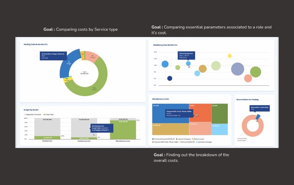
Unit Rate
Per-unit cost, crew productivity
Budget Summary
Allocation, invoicing, reconciliation
Impact
- Dashboards structured so essential details are findable within minutes for quicker decisions.
- Filters for major categories added to increase efficiency.